
U&I BTQ
Art Direction
Brand Identity
Photography
Advertising
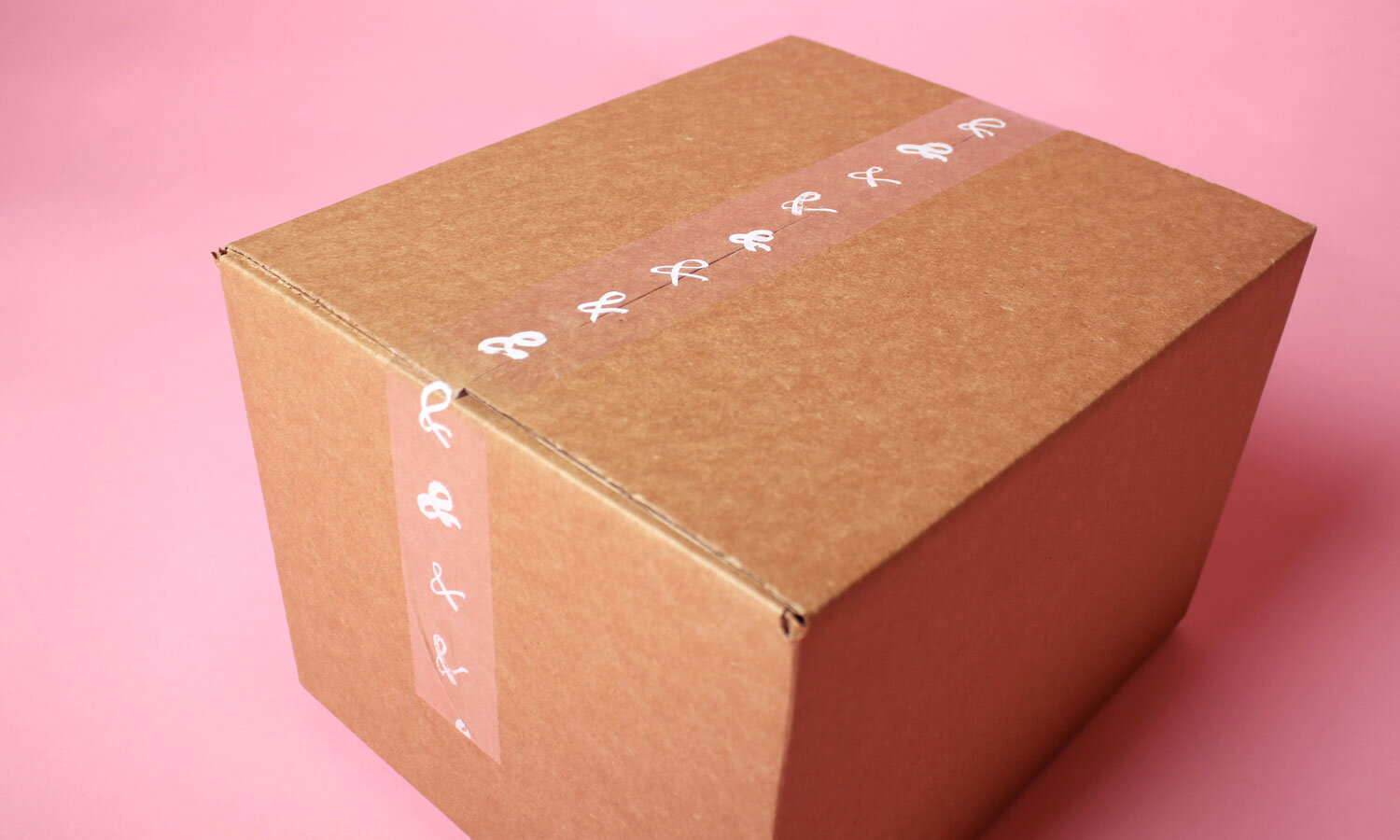
PackagingObjective
Evolve a modern boutique’s brand to match their fashion-forward style.
Background
U&I’s founder Maya has a mission to empower every woman who steps foot into her shop. Since U&I is founded upon the idea of relationships and connection, the symbol of an ampersand became the focal point of the brand. Just as Maya is personally involved in her business by hand selecting each item she sells, she left her mark on the brand by painting the ampersand for the final logo.
Art Direction
Our moodboard and direction was bold and feminine while still tapping into an air of imperfect elegance.

Design Moodboard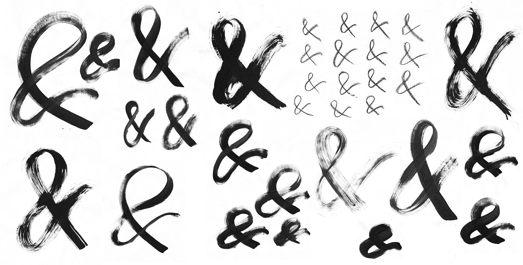
The dozens of hand-drawn ampersands used throughout the brand served as interesting textural elements and represented the uniqueness of the women who shop at U&I.


In the process of developing the brand, we created a complete brand guide that encompassed standards for the brand elements, photography, website, and packaging.


“I have never had anyone be able to translate my idea about U&I BTQ until we met Heidi. She was able to put all the emotions into our branding with simplicity and yet put so much meaning behind it. She exceeded all expectations about the message and meaning behind U&I BTQ.”
— Maya Ozokur
Owner, U&I BTQ
Creative Director: Stephean Grimes
Art Director / Design Lead: Heidi Boor
Design: Julianne Patterson
Photography: Heidi Boor
Strategy: Maury Molyneux
Copywriting: Amanda Gibson
Work completed while at Mighty.